
Editorial Project
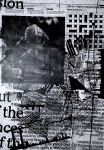
Got set this project on Monday, we have to (in groups of two) examine and analysis The Times newspaper and then create a personification of the paper i.e. if The Times was a living, breathing human, what would that person be like? Where did they grow up? Who were their parents? Why do they act a certain way? We then have to take this character and imagine them having a ‘Freudian-slip’, whether that be a deep dark secret or a suppressed desire/emotion. And then take this slip and represent it on a double page spread. The imagery has to relate back to The Times, whether it be form or structure or layout, any little detail within the paper, but these elements must be distorted and subverted to convey the uncontrolled aspect of a Freudian slip.
For our Times character we came up with a 11/12 year old boy who’s an only child that’s been home schooled and raised in a middle class family. He’s never been allowed to be a kid, to mess around, have fun, be a bit mischievous and immature. And this is going to be his Freudian slip: a repressed childhood.
Here’s some experiments of using and distorting the different elements of The Times:


Party Invite by Goma


Juxtapoz Nov 12
“Art has been successfully used by liberators and dictators alike. It is a powerful tool that is in your possession.” (Ron English)
This months issue of Juxtapoz is about politics and art, curated by Ron English. “What the artists in this issue have in common is, whether you agree with them or not, their stances are the products of their own research, life experiences and passion. Their opinions are not off-the-shelf talking points spoon-fed by corporate shills.” (R.E)
The first artist interviewed is Shepard Fairey… Over the years I’ve heard many different views on him and his work, and personally, well I don’t really know what my opinion on him is. I do think his iconic style has a lot of appeal, aesthetically and politically. But I feel his style has been copied and used for so many things that it detracts from his work and his talent. And because this style has become so mainstream I find that it lessens the political impact of Fairey’s message.

Love Is the Drug by Shepard Fairey
First Photography Project
This week we were set a photography project to explore the idea of ‘Space’. I started off by photographing the local train station but it was only when I was leaving that I started to get some interesting photos.

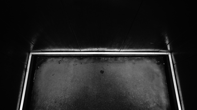

The thing I find interesting about these photos is the ambiguity of them. I spent so long at the station looking at the structure and the shapes within that structure that I started to over complicate things. So it was only when I was leaving the station via the lift that I discovered this ambiguity of space, contained within this small metal box.
Visual Thinking: Highlighter Style
Our second week long brief: For this project we were asked to choose from a selection of drawing materials and end up with a 60 second video that fights for the existence of our chosen piece of equipment (in my case, a highlighter).
After a bit of research and a lot of highlighter doodling, I discovered that highlighters are UV reactive. This is what gives them their unique glow and luminosity, which, I feel, is what defines a highlighter, i.e. the reason we use a highlighter and not just a thick felt tip pen. So I decided to buy a UV light and do some experiments…


Salute
Come across this design and illustration group the other day, Salute, founded by Ralph Francis Fox. Thought they had some interesting work and wanted to share…


Asian Graphics Now!
I was in HMV today and spotted this book hidden in a corner and thought it looked pretty cool so decided to get it! There’s some really awesome stuff in it. It features the best and most recent advertising campaigns, posters, brand designs, package design and editorial design from the whole of Asia.


Occupy George
I recently came across the info-graphics campaign and thought I’d share it.
‘Money talks, but not loud enough for the 99%. By circulating dollar bills stamped with fact-based infographics, Occupy George informs the public of America’s daunting economic disparity one bill at a time. Because money knowledge is power.’
I really like the way Occupy George has approached this campaign. Printing onto something that everybody uses, everybody touches. And there’s a great use of colour in the design, using the green of a dollar bill against a vibrant red.

‘Just 400 Americans control as much wealth as the bottom half of the entire country.’

‘The income growth disparity in America is wider than it was
pre-Great Depression.’

‘In America, the average CEO earns 185 times more than the average worker.’

‘The richest 1% of Americans control over 1/3 of the wealth,
leaving the bottom 80% with less than 1/5.’

‘Unless things change, it’s safe to assume that our money will ultimately end up in the hands of the one percent.’
Great Cyrillic Image!
I came across this photo on Facebook site that’s dedicated to Cyrillic Typography (cyrillictype) I find this sign utterly amazing! It was taken in Bulgaria and the sign has clearly seen many many years. I love how it was painted yellow years ago but now that yellow brings out the rust and adds such character and interest to the text. I’d love to have this displayed on my wall somewhere!

